For the last few months I have been specifically focusing on getting the design for the title cards just right. I feel this falls under the remit of design which is not my strongest area. However after many tests I think I have finally hit on an aesthetic I like and feel represents the trailer perfectly.

Figure 1.

Figure 2.

Figure 3.
I started by looking at how other productions tackled this problem, particularly looking at colour and font choice and how and why this relates to the aesthetic of the overall product.
As previously mentioned, ‘Isle of Dogs’ has been a very big influence on the feel of my trailer so far, so it made sense to take a look at what they did. Anderson has relied heavily on minimal colour palette, Red, Yellow and White on a Black background. They do alternate how these are seen so for example it isn’t always the subtitle that is yellow, sometimes its white. This colour scheme reminds me a little of teletext which isn’t great, I am also not sure if this gives me a strictly Japanese feel. The font use for the English text is, from what I can tell just a mirroring of the Japanese font. This gives the characters a slightly unusual different look which is in keeping with the film, the English text and how it is written for me is the most successful part of the design. They repeat it again on the main design for the promotion of the film.
My first attempt of trying replicate this aesthetic for my trailer went quite well (fig. 1, 2, 3), but it feels a little too comical. A bit too much like I am trying hard to parody HKC, I don’t think the visual language needs to 100% fit this mould as the research for the trailer has lead me away from this area now anyway.

Figure 4.

Figure 5.
The second test addresses the above issue, fig 4 and fig 5 are examples of the evolution away from the comical text. Instead now I’ve used a more classic letterpress font (Cocogoose) for the English type and a more classic chinese font for that type. In fig. 5 I have used the chinese stamp for the first time, although its not particularly prevalent in this image I really like their aesthetic, I think they really encapsulate chinese art and culture perfectly as a visual signifier. When I look at the Isle of Dogs artwork and promotion I can see they have taken iconic Japanese images, like silk block printing and the little Japanese stamps which carry that feeling of Japanese culture to the viewer so they understand the setting and context - Using a visual language to set the right tone basically.
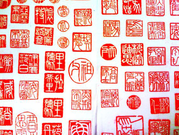
Figure 7.

Figure 8.
Fig. 7 and fig. 8 are classic examples of chinese stamps, showing how they are made and the look they create. I am a big fan of the stamp look, fig. 10 is an example of where it has been used in a similar context to how I will be using them, in a kind of iconic fashion. The still is from the opening scene of a HKC film shown to a western and chinese audience, so its true to say that people will understand what this stamp is and its connection to china even if not 100% understanding why its used they should still be able to make the right connection. So in other words I think using it will represent what I want.

Figure 9.

Figure 10.
Fig. 9 is my initial attempt at using the stamp technique, I think this has been really successful. It is created using brushes and relief techniques in photoshop, rather than making it an original stamp cut from wood or Lino which I have also tried as you can see in fig. 11. I find it very difficult to get to get these original, hand made stamps into the computer and make them sit well within the rest of the animation. Controlling the colour whilst maintaining a professional finish takes so much time relative to doing it in photoshop. On top of the stamp I have also been working on taking the 1970’s speckle and screen crackle slightly further, essentially being inspired by that effect and making it do something else. Rather than just recreating it like I did on earlier animations. I really like how this plays against the stamp, and then conversely how that plays against the calm landscape scenes. It carries the right aesthetic in-terms of what the real stories are saying, giving it this gritty feeling. As this is my first attempt I think I should try and go a little further with it all. It is a positive first step but I think I could definitely tighten it all up, for example the type used is a bit normal. As you can see in fig. 7 and fig. 8 the types used in the stamps are typically more beautiful, or rather much older looking, maybe not everyone would think they are more beautiful. I will look more at chinese text on this matter however for the stamps I think I should make them feel a bit more authentic.

Figure 11.
Fig. 12 is my second look at the stamp, now I really feel like I am getting somewhere with it, I am very happy with how authentic they look. I've been looking more at the hand created ones to see how I can make the photoshop version feel more real. What seems to be the defining factor is that you can see the paper coming through the print. In this case black paper. I have also eaten into the red print using a half tone brush which is simulating the stamp not fully printing properly which is a regular issue. The best part however is how well the ancient chinese, traditional text has worked. As I previously wrote about using the wrong type for the chinese characters, correcting this has instantly made it sit better as a design. Fig. 13 is an inverted version of the strong stamp which is another popular way that the stamps have been made in the past. Varying the look I think helps to keep the artwork and interest fresh whilst still holding true to the aesthetic. On the type front, I have been speaking to my chinese collaborator about authenticity, making sure that the animation makes sense to a chinese audience. One of the things Tuki mentioned was that the more modern chinese font used in Fig. 9 and in a previous image which you can see in Fig. 14 doesn’t look very nice to chinese eyes, maybe a better way of putting it, is that it isn’t quite so aesthetically pleasing to them. I think this should be a serious consideration for me, especially seeing how well the tests went after changing the writing to a more traditional font. So as a side note I decided to change the font in the old image to bring it inline with this new research, which although I don’t think has improved the image in this particular instance (see Fig. 15) I think I can work on this more and maybe make it fit into the image a little better.

Figure 12.

Figure 13.

Figure 14.

Figure 15.
In fig. 16 I have tried to address the issue of jarring between the chinese calligraphy the artwork itself. The font is the same as the font used in the successful stamp tests, but written out like this I am not too sure if I like it as much. It certainly works for the stamps but I wouldn’t say it looks overtly chinese, you could almost say it looks Incan or Mayan maybe. Thinking about this I started work on Fig. 17 which successfully corrects the issue along with the jarring. The font works much better and now that I have applied a similar print look to it that I used for the stamps its fitting into the artwork without issues. The English text I have kept in the same font, however I have also applied the 'paper coming through the ink technique' that I used for the stamps and similar to the chinese text it has just helped it to be situated on the page better. I have also added a little motion blur and dropped that behind which has helped it to feel slightly less flat and creates a nice interaction between the English and chinese fonts.

Figure 16.

Figure 17.
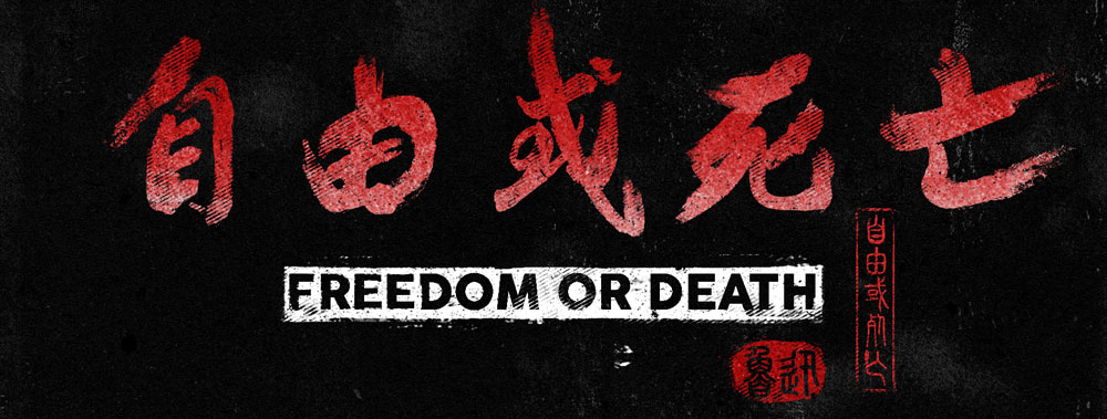
After more successful tests on embedding the Chinese and English texts I thought I should take a look at designing a promotional title card. Fig. 18 is my first try and again because of everything I have learnt before I was quite confident that it would come out well, and as predicted I am very happy with it. The writing isn’t jarring or too flat, its powerful and bold whilst staying true to the hand written style. The only issue is now that the English writing has lost its impact compared to the strength of the chinese calligraphy. A nice touch though is the stamp of 'Freedom Or Death’ just to the right, I think it caps this promotional image off perfectly. The diminishment of the English writing is an issue however so something will have to be worked out to counteract this. One of the things that remained the same is the background, the bold black makes everything on it jump out even more, added with the printed texture on top to make it feel more rustic or well used is a nice touch. I think each different scene will have a different paper texture, but I won’t make it move around like that of the Marks and speckles as I think too much would be happening on a page then, making it too busy and confusing to the eye.
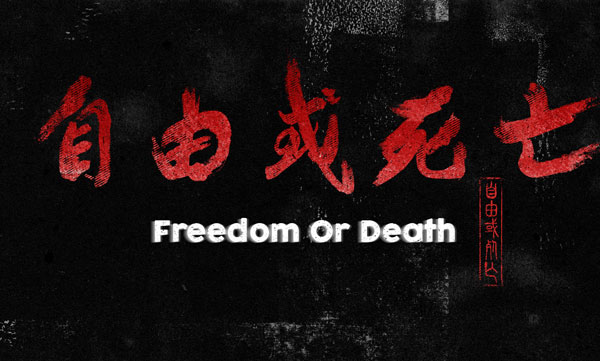
Figure 18.
Fig.19 is quite an improvement, taking the idea of the inverted chinese stamp and using it fore the English text seems to have done the job, it really helps it to stand out now as the bolder white contrasts well against the red and black. There is now no mistaking the visual language of this image, it isn’t confused in anyway, but most importantly does not just feel like a HKC rip off, it has moved away from this low budget aesthetic into something new I think.

Figure 19.