
It is still early on in the development process of the project, but I wanted to get started on making some images.
It is quite nice at this early stage of the project to just start making images related to the research completed so far and not really worry about how effective they are in translating a message or narrative. One of the key areas I'll be looking at is colour scheme - what schemes fit the mood and feel we are trying to convey. I'll be thinking about light sources and where the shadows fall. Thinking back to Hopper's work, I will be looking at playing with the position of a central character, how they might fit into a space and how to achieve the sense of unease that he does so well.
The first experiment was inspired by a hotel room I had recently stayed in. There was nothing particularly out of the ordinary about it. In fact, it was its ‘ordinariness’ that I wanted to focus on. (see figure 2)
I used a bold red, a colour I often use when starting an image just so the page isn’t white. Coincidentally, this does mean the colour schemes for a lot of my professional work come out more red than anything else. Using red is a nice place to start but I don’t in any way see the colour as defining the project, or a least I will try to let the project define the colour scheme rather than just picking any colour.
Interestingly, I can feel myself already wanting to justify so much. The feeling of 'this is just a rough so don’t judge it …or me' is just a side effect of showing the whole process of a project.
As a lecturer I see students, uncomfortable about showing their work, ripping pages out of their sketchbooks, gluing pages together or simply just 'forgetting to bring their work in today'. Holding back the important processes, or being unwilling to show the first early drafts purely because it's not quite there yet is something I preach against a lot, so I will be sure to show you everything I do towards the final outcome of this project. Please forgive any self deprecation.

Figure 1

Figure 2
Now, onto the choice of text. I chose this type - even though I'm using it as a bit of filler at the moment - as I feel it looks slightly 1920’s. No more research than that has gone into it at this point. The other reason I have added the text is that it can sometimes help to see images with a bit more context.
Once I put this image together with the text, I was pleased with it, which is not something I would often say about a rough. It made it feel more real, even with the small amount of research I had done so far, and it felt that there was already some substance to the project. What I liked mostly about the image is the shadow being cast by the bright light from the bathroom. However, what I think hints most at a story, just as Hopper’s ‘Hotel Room’ does, is the strange figure you can only just see in the mirror.
Although pleased with my progress on my first image, I didn't want to linger too long. At this stage, I think it’s important to simply get what’s in my head down on the page whilst it's fresh in my mind.
My second image (see figure 3) - this time drawn from reference - is of something iconic to hotels; the hall way. Walking down hotel halls is something I've done a million times. It's something I rarely think anything of, but the hotel corridor is something exclusive only to hotels. Specific. Modern offices are not made like this - perhaps apartment blocks are - but in my (British) experiences, apartment blocks tend not to be as vast as the ones you find in hotels. The floor tends to be carpeted. The doors all represent places you could go, but also might not be allowed to.

Figure 3
Let's revisit the 'voyeur' idea I mentioned in the Hopper post; In a block of flats, the doors lead to someone else's home. You really cannot go in there unless invited. However, in a hotel, the room beyond the door you look at tomorrow could be yours. What if you were given a hotel master key by mistake; if you knew that no one was going to be in there, how many rooms would you walk into? The carry over from the last image is the light source. It sets so much of the tone. It is true that this kind of lighting would be rare to come across, however I think what it does do is accentuate the feelings you get when walking down these often dimly light halls. No figure this time - it’s primarily the heavy shadows that give these images their sense of trepidation. It's possible that the emotion could be heightened by including a figure in the image, and I think this is the next question to pose.
The third image (see figure 4), which has been rendered to a much more in-depth level, is of a hotel called the Ladbrooke, in Digbeth, Birmingham. At some point I am hoping to visit as it has loads of character about it and I reckon it probably has many hidden gems, making it an ideal setting for any potential stories. For now, this is a drawing of the exterior, taken from a photo which you can see in figure 6. You can see I've been selective about which parts of the building I have included. The result of this is it accentuates the shape of the building. This in turn makes it a little easier to draw. I have also played around with the perspective of the building and the use of heavy blues in the colour scheme, which I think makes it feel much more imposing, dominating the surroundings as it does in real life. The initial point of creating this image was to find out if the use of heavy shadow and the addition of a figure creates more intrigue, or boosts feelings of voyeurism; due to the scale, I'm not sure i've answered that question. Aesthetically I like it, but the placement of the figure and the scale make it less effective. I like the way the shadow cuts across him, bringing him to your attention. You don't immediately wonder what he’s doing there, because he’s a shady looking guy in a shady looking area - one might simply assume that he is selling drugs or waiting for a shady mate. It doesn’t feel like a mystery, and there isn’t the same intimate connection that you feel when looking at one of Hopper’s paintings.

Figure 4

Figure 5

Figure 6
Figure 7 is something quite different entirely. After watching the film ’Thunder Road', I felt really inspired to do a piece connected to what I am working on, whilst also responding to the film. Without ruining anything, there is a beautiful part that reveals something that at first felt strange in the previous scene. It was a particularly brilliant sequence of shots that left a big impression on me. The film also has a very moody, Hopper-esque feel to it, so I thought it wouldn’t be a great leap to include it within the project. What I find very interesting, given my previous question of whether a person and shadows work in unison to create the perfect blend of intrigue, voyeurism and a whirlwind of emotion, is that this image does not feature a person. The figure is replaced by the suggestion of one. This time the intrigue is created due to the fact a person isn’t present. That is to say that all the elements are there for a person - the chair, the pen without lid and the hands on the wall. The emphasis of a persons story is increased by their very absence. Therefore, I am working towards an interesting equation - long, heavy shadows + person make for a literal story. Most of the pieces are there in front of you, meaning you already have a generally solid idea in your mind of what is happening in the picture. However, long shadows + suggestion of person I think gives much more mystery and intrigue. You begin to fill in the blanks yourself. You might then say that I am criticising Hopper for being too literal, but there are plenty of his paintings where people are not present. Some of his most famous works - Nighthawks, Chop Suey - all feature prominent figures in unison with heavy shadows and dark corners. Possibly, I am biased because of my sentimental feeling towards the film that inspired figure 7. Perhaps I've asked more questions than I've answered, but I'm still excited and I can see this line of inquiry really going somewhere.

Figure 7
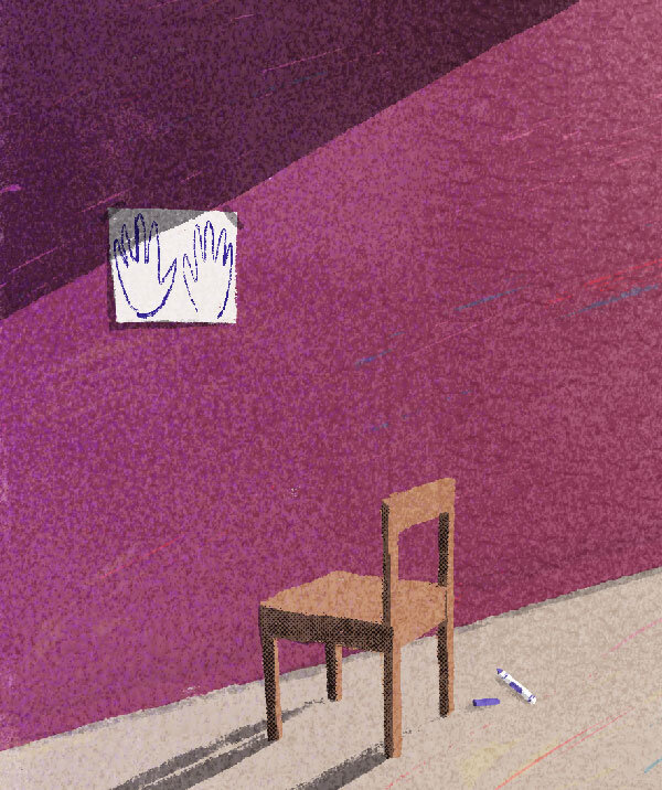
Figure 8