
How do I get motion to still or static images? I really like how the film posters below have done this, the posters have been painted which has enabled the artist to add a blurred or dragged quality. I think this lends a really nice quality to the artwork, and gives it a feeling of motion. It certainly adds a dynamic feel even if it isn’t totally a feeling of motion. Before I start doing animating I think this is something I should focus on, then from there I will transfer what I have learnt to animating and see If it has the same outcome even when it is in motion.

Figure 1. *Red circles added to show areas of discussion

Figure 2. *Red circles added to show areas of discussion
These examples are more contemporary illustration, but still really successful in creating that dynamic, feeling of motion in a static image. They have used two different techniques, one is done using a blurring of the outside edge then getting softer towards the centre which gives the impression of zooming into the centre. The other have duplicated limbs and used what looks like fast brush strokes of ink to show where the sword or arms have travelled from. This version is what I think would most suit the artwork I want to create, I also really like chinese style portrait layout, A lot of HKC posters I have come across are laid out like this as well, I think it feels more authentically chinese.

Figure 3.

Figure 4.
Below I have a couple of attempts at creating some more dynamic images, thinking about the idea of motion and what this does to the visual language of the image. Does this add to the feel and the right aesthetic or does it cloud the image, over complicate it? Figure 5 is a mono print of a strong female character from a great HKC film called ‘Come Drink With Me’. Similar to the yellow image above I have set the context of the image in a HKC poster to try and give it the right feel and carry the correct message. The mono print I think works really well for this project, it gives the image a grainy 1980’s look, as oppose to a really slick modern feel. I’m trying to get that grainy production company feel so my next step was to put the drawings into photoshop and merge them together. Figure 6 shows the final attempt. I think it has worked well, maybe slightly over complicated, but not too much. I really like how it is cropped in the portrait style, you would think that having this expressive image contained and cropped within this format might limit it some what but if anything it has accentuated it somewhat. By containing the artwork it has focused it, making you believe that it's all happening outside the frame, by seeing just enough inside the frame to convince the viewer.

Figure 5.

Figure 6.
I decided to Rizo print the image as well as I have been really pleased with my previous attempts, as discussed before its given the artwork a really strong professional finish which because of the contrast really grabs you. The impact of the bond red which I had in the photoshop file is lost somewhat but the overall aesthetic I do prefer. One of the most successful parts of it is the font, I think that in the photoshop file the text looks too separate, it sticks out too much as its so sharp and slick compared to the grainy artwork; the Rizo print effect on the lettering I believe solves this, so although I might not be able to Rizo print my animation, I might be able to do the text as a Rizo print then digitalise it. This will need some investigation, next step is to see if it actually transfers to photoshop.
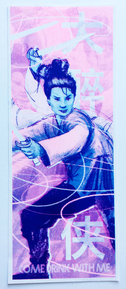
Figure 7.

Figure 8.
I really like these close ups of the Riso print. Being about to see what make up the image is really fascinating and also makes for a nice image on its own. I think this type of print really lends itself to a professional finish, much like a screen print or Litho print. I would like to try out both of these other options to see which I prefer, paying special attention to the quality of print as i think it has a really impact on the image. They are all techniques that would have been used to print HKC posters so all relevant areas of enquiry.

Figure 9.