
For some time I have wanted to develop how I draw, and to really take a detailed look at how I build up an illustration. This post analyses these foundations in an attempt to create more emotive and aesthetic images that elevate my current level of artwork. Although I have been researching mono printing, I think it is also important to look at how I use digital brushes as the scope seems to be a lot larger. Although if I am honest I have only been using digital brushes for a year or two so knowledge of what I can do with them and their scope is not very big. In terms of professional finish they seem to be really good, giving a very close to life like look of what using real paint brushes or oil pastels are actually like. One of the benefits is that the range of possibilities is massive, all these artists below have created their artwork using digital brushes, but the important part is that they are always mimicking the hand done original effect, whether it’s oil paints, Lino printing or gauche.

List Feng
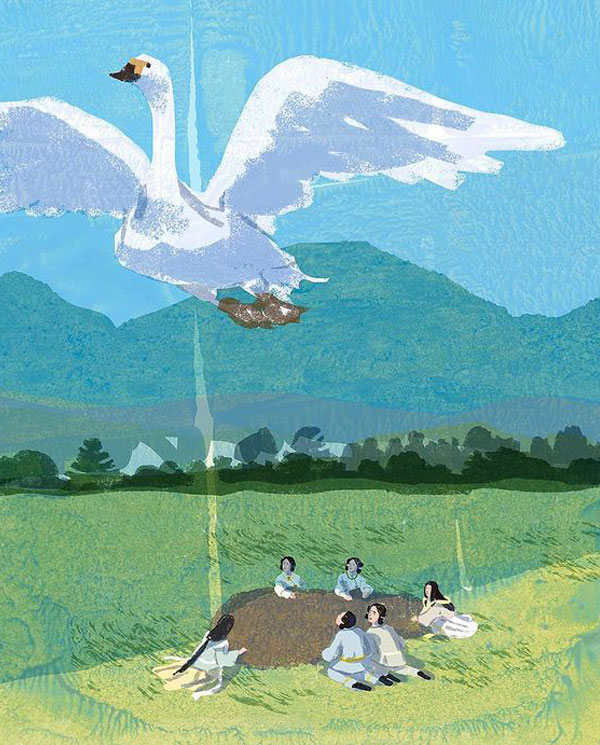
Tatsuro Kiuchi

Amanda Winterstein
The effect I am looking for is something that feels authentic, it doesn’t matter what medium that is. As long as it looks like an organic hand done outcome. The reason for this is that I have found creating directly in photoshop is so much quicker, I don’t need to wait for drying, I don’t need to clean up mess, and importantly I can undo. It’s this undoing that makes photoshop so valuable, without it I have wonky poorly conceived half done images. Also it's very difficult, not impossible, but difficult to animate hand done mediums like paint. Scanning can often be an issue, not getting the colours right, and then importantly being able to edit the images afterwards is a lot more difficult if it is not already in photoshop.

This first image is just to make sure I get the face right to start with, it looks very flat at the moment and quite digital but what is really good is that I can do this drawing on one layer then do the painting over the top on a separate layer so I don’t have any lines. This is very hard to do by hand, unless using an acetate sheet maybe. Next stage is to find a medium I like that works with the aesthetic I want, in this case something that resembles the paintings of HKC film posters.

This water colour is a good first example of being able to do something that feels authentic. Maybe the hat isn’t quite as strong as the face and could do with some work but overall I like how it has come out, the texture from the watercolour brush is just the kind of thing I am looking for, something that feels authentic with a professional finish. Being able to accurately paint the face without having to worry about it form allows for this professional finish. Working on the drawing, making it more confident and not worrying about it looking like a ‘good drawing’. To do this I think drawing by hand first then scanning in the drawing, much like I did in the previous stage, however drawing right into photoshop means I can edit the initial drawing too much, leaving it a bit devoid of character.

This version is me trying to switch it up a bit, one of the numerous benefits of photoshop is that I can change the colour of the artwork with great easy, this allows me to change the direction of the artwork quite radically. However I feel this version can only go so far, so next I am going to redraw the face using a different method. I don’t like that the image still feels a little flat, I hoped that changing the colour might alleviate it but that was not the case. I do really like how the two colours interact with each other but I think that the water colour doesn’t have quite enough of a texture to it, maybe its a little soft, I want something that shows its strokes more, more expressive like the figures themselves and gives the image more motion which is something I identified in a previous post.

This version is much more successful, it is much more dynamic and as a result feels more authentic as an image. It is still rather flat but a texture on top of this would solve that issue I believe. I have used various brush types in this version that mimic Gauche or oil paints giving the image an instant level of prestige. These types of brushes I think are much closer to the paint and brush type used to make HKC posters, as well as this I believe this image has a 1960’s chinese propaganda poster feel to it making it feel quite chinese.


These final versions show the introduction of a paper texture layer added to it giving the image more punch in terms of colour and more depth in terms of the feel. I have played with the colour on the face a little to see how it effects the image, but for this occasion it doesn’t seem to serve a purpose. Adding a background that follows on from my previous post about motion I think finishes the image off. This is a really encouraging process for me, I think it has shown how focusing on this side of my image scan strengthen my artwork and certainly gives a good level of professional finish.

A problem I am having is moving away from using just mono print drawing as the corner stone of my artwork. Nearly 100% of my artwork used in my professional practice is done with mono print as the central focus. Moving away from this could change what is known as my style, is that a problem? Evolution of my work has happened since I left uni in 2008, so I shouldn’t be happy with settling for it being like it is. I also believe that adding new techniques and methods to my skill set like animation, is a great opportunity to evolve my work as I will be looking towards different clients rather than my normal ones.